
Brand Strategy
Loughborough Junction Action Group
A South London community charity asked for a clearer website. What followed was a brand refresh, a site rebuild, and a second engagement that folded three project sites into one platform.

Where LJAG was, what they asked for
LJAG reached out in the summer of 2024. By then they were eighteen years old: running Loughborough Farm, The Platform Café, and Grove Adventure Playground alongside craft workshops, skills sessions, community events, and the wider neighbourhood advocacy work that doesn’t sit neatly under any one label. A lot had grown over those eighteen years, but the website hadn’t kept pace.
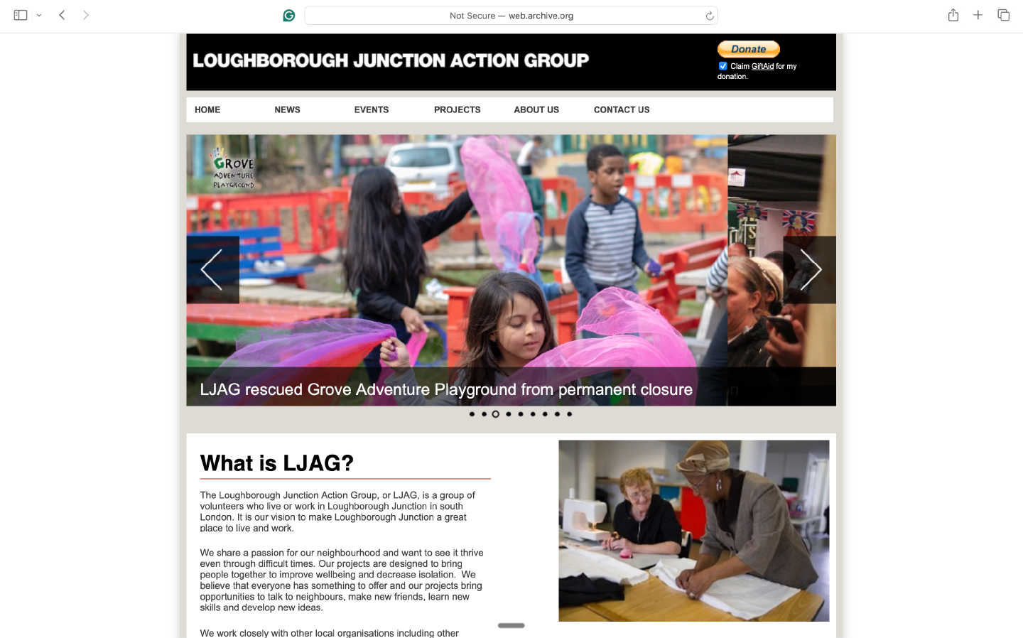
The main site was practical and honest — a news feed, an events calendar, contact details, a donate button. It was exactly the kind of site a community group builds when it needs a presence and doesn’t have the capacity for anything more elaborate. And for a long time, that was the right site.
By mid-2024 it was no longer the right site. The navigation was flat — Home, News, Events, Projects, About, Contact — in a way that made LJAG feel smaller and more provisional than it was. The Farm, the Café, and Grove each ran their own separate sites on separate platforms. There was no connective tissue between them and the parent organisation. A new visitor would struggle to understand that LJAG was one organisation with four distinct physical spaces and nearly two decades of embedded community work behind it.
The organisation had, in effect, outgrown its description.
The brief was clear and fairly modest: a cleaner, friendlier main site, easier to navigate. Newsletter sign-up, donate button, policies and documents — all preserved. They asked whether the brand needed refreshing. They imagined the project sites staying separate.
I started with what they’d asked for. The bigger scope emerged from the work.
The first engagement — rebrand and main site
The rebrand
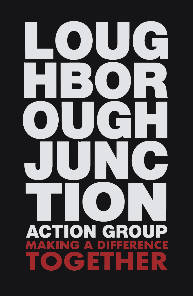
The first question was whether to refresh the brand. LJAG’s existing identity centred on a stacked, blocky all-caps wordmark in black, white, and a hard red. Strong and legible, but not flexible — and the red had a harshness that didn’t suit the organisation’s warmth. They agreed to fold a brand refresh into the work, so we started there.
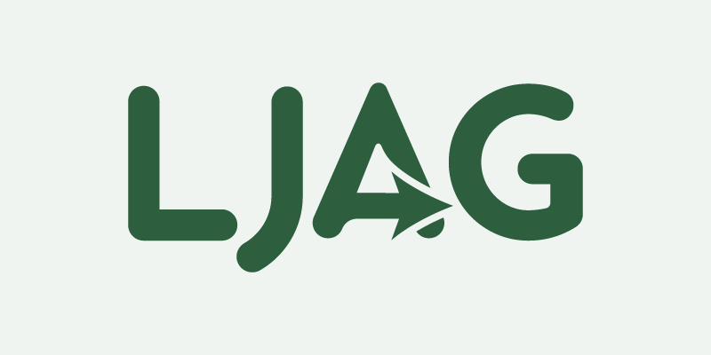
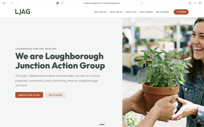
The wordmark moved away from the stacked form towards a cleaner mark in Quicksand — rounded, open, and community-facing without tipping into childishness. A small action arrow sits within the letterforms: a quiet signal of forward momentum, embedded rather than announced. Outfit pairs with Quicksand for the site typography, taking on the display and heading weight while Quicksand carries the body copy — a combination that gives the brand a more confident visual hierarchy without losing its warmth.
The palette moved through several iterations before settling on brick red and forest green: colours rooted in Lambeth — the brick of its buildings, the green of its community spaces. They hold up across contexts in a way the earlier palette didn’t, and they feel genuinely local rather than designed-in.
The main site
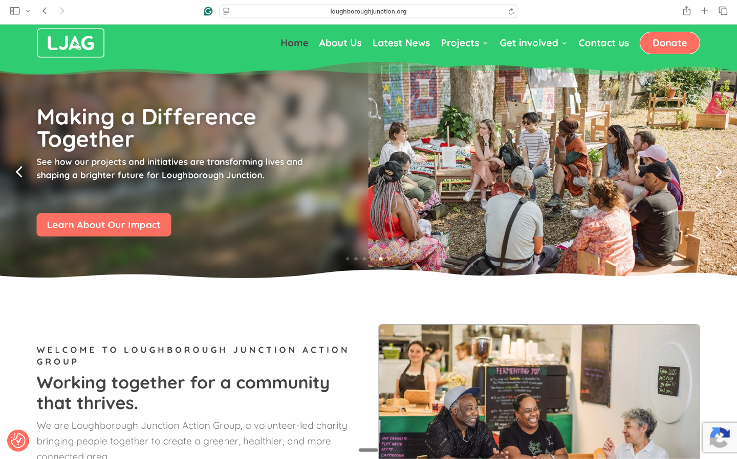
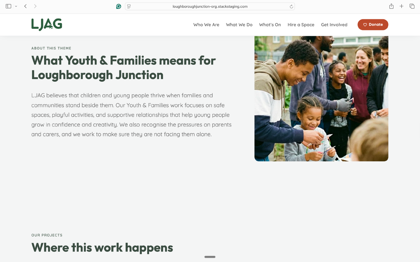
With the new identity in place, the main LJAG site was rebuilt. Cleaner architecture, friendlier visual language, easier to navigate. The section structure was refined through the work rather than taken wholesale from the brief. Children and young people became Youth & Families — naming both sides of the relationship rather than only the service target. Employment and training became Skills & Employment, which describes what LJAG delivers in terms a potential participant would recognise, not in terms that belong to the organisation’s internal language. News and events were combined as requested. The newsletter, donate button, and document archive were all preserved.
The result was a real step up: a site that felt warmer in tone, more considered, and more honest about the organisation’s breadth.
But the project sites still ran their own lives on their own platforms. The Farm had its own site. The Café had its own site. Grove had its own site. LJAG was still presenting as one organisation among four rather than as the parent holding them together. That mattered — but it wasn’t what LJAG had asked for in the first engagement, so it stayed unresolved.
Coming back
After living with the new site for a while, LJAG came back.
They’d seen how the main site felt in practice — clearer, more like them — and that had made the fragmentation of the project sites harder to ignore. The Farm, the Café, and Grove each had a presence online, but they weren’t reading as part of the same family. A funder or partner moving across all four sites would have encountered four unrelated things. A resident who knew Grove well might never discover the Farm.
They asked for the bigger thing: bring the project sites in. Stop running four separate identities. Make LJAG legible as one organisation across all four spaces.
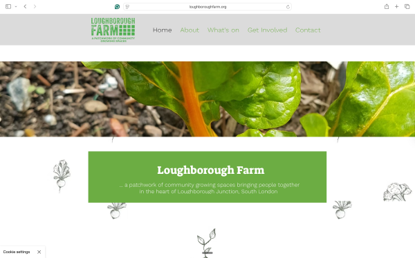
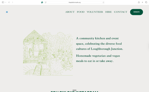
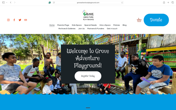
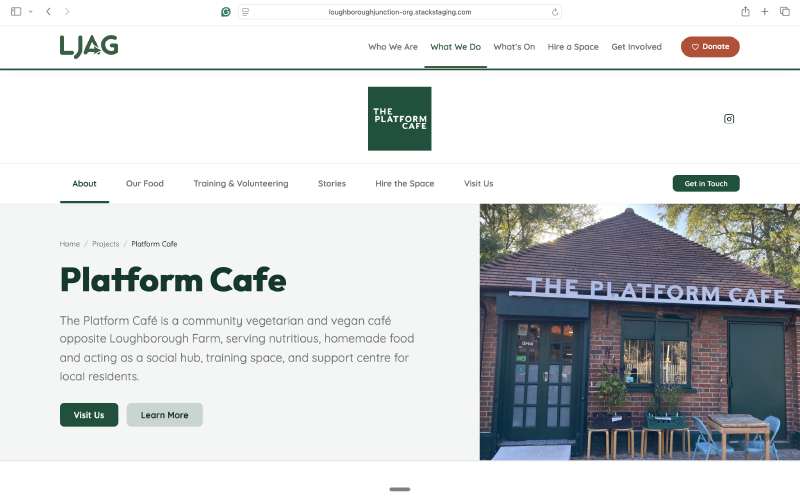
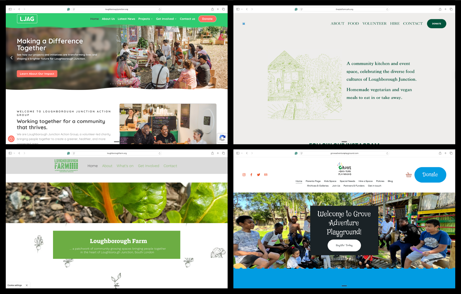
That changed the shape of the work considerably. Holding Loughborough Farm, The Platform Café, and Grove Adventure Playground within a single platform — each with its own character, its own audience, its own palette — while making the parent organisation clearly visible behind all three: that was a different problem from a site refresh.
The new main site started feeling like us. We want the Farm, the Café and Grove to feel like part of the same family — and to feel that way to everyone who visits.
Trustee, Loughborough Junction Action Group
The second engagement — one platform, three projects, one parent
Information architecture
The IA problem was that two legitimate user journeys pull in different directions. A funder or partner wants to understand the breadth of the organisation — what themes does LJAG work across, what’s the range of activity across all four spaces. A parent with a child at Grove wants to find Grove: quickly, clearly, without needing to understand the full organisational structure first.
A site organised purely around themes would serve the funder and lose the parent. A site organised purely around project locations would serve the parent and obscure LJAG’s cross-cutting work. The solution was to run both axes: Projects as primary destinations in the navigation, Themes as the connective structure that surfaces relationships across them.
The themes themselves were refined through the work: Health & Wellbeing, Youth & Families, Skills & Employment, Sustainability & Greening, Services & Facilities, Impact & Achievements, Volunteering, Support LJAG. Some evolved in naming along the way. Learning & Development became Skills & Employment — a shift from how the organisation categorises the work to how someone who needs it would think about it.

Content model
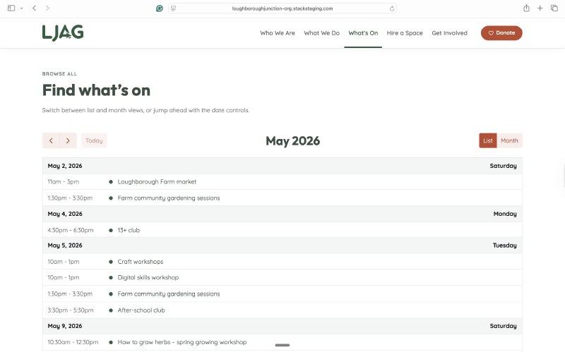
Projects, Programmes, Events, People, and Documents were treated as structural decisions, not just database categories. The point is that content gets entered once and surfaces in the right places: an event connected to the Farm as a location and to Sustainability & Greening as a theme appears on the Farm project page, on the Sustainability & Greening theme page, and in the main events archive — without anyone having to update three separate pages. A team member can add an event without touching a template.
That flexibility is what makes a site maintainable over years rather than months. LJAG’s team can keep the platform current as programmes change, events come and go, and new people join — without needing a designer every time.
Staff hub
A staff hub for internal documents — gated, absent from the public navigation. Not the most visible part of the platform, but a real one. The site was designed around how LJAG actually runs, not just how it presents to the public. Staff have somewhere to work from.
The site in practice
The platform launched with real content in place: project pages for all three sites, a working events archive, a populated theme structure, documents, and a gated staff hub. Each section has a specific job.
The homepage introduces LJAG as the parent organisation and points outward to the three projects — clear enough for a first-time visitor to orient quickly, without flattening the complexity behind it. Project pages give each space enough room to tell its own story: photography, visiting information, current programmes, events, a feed of relevant news.
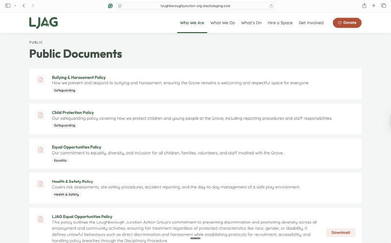
The events archive is filterable by project location and theme, so a resident looking for food-growing sessions and a parent looking for Grove holiday activities are navigating the same content in different ways. The documents section gives policies, annual reports, and board papers a proper home — searchable, structured, and separated from news content. Governance is where funders and partners expect to find it.
The staff hub is deliberately quiet in the public interface: a login link, nothing more. The line between what’s public and what’s internal is built into the structure.
What the platform lets LJAG be
LJAG now reads as one organisation across four spaces. That sounds like a simple outcome — and in some ways it is — but what sits behind it is a structure that can carry the organisation forward rather than one that will need rebuilding when something changes.
The platform absorbs new content without anyone having to design a page. A new programme gets entered once and appears on the right project page, the right theme page, and in the events archive. A new person gets added once and surfaces wherever they’re connected. When something changes — a theme expands, a new programme area opens — the structure holds it without a rebuild.
A funder arriving for the first time can understand the breadth of the organisation in a few minutes: what LJAG works on, where, with whom, at what scale. A parent who only knows Grove can go straight there and find everything relevant to their family without navigating the wider organisational structure first. A staff member has somewhere internal to work from. The team can keep the site current themselves — the WordPress admin was stripped back to what they actually need to touch, and they were trained on what remained. The platform they’d previously found difficult became one they could maintain.
What the project was, looking back, was less a website redesign than a repositioning of an organisation that had outgrown its description. The site is the most visible part of that work. The more durable part is a structure that gives LJAG room to grow into what it already is.
In more depth
A — Information architecture
The sitemap runs across three levels. At the top: Home, About, Themes, Projects, Programmes, What’s On, Get Involved, Documents, and Contact. The Staff Hub sits at the same level but outside the main navigation — accessible via login, invisible to unregistered visitors.

Creating LJAG Core as a named project location was a deliberate decision. The Farm, Café, and Grove are distinct physical places with their own audiences; the broader LJAG work — neighbourhood advocacy, governance, wider partnerships — doesn’t belong to any of them. Rather than letting one project site carry the parent-level content, LJAG Core gives that work a home of its own. It keeps the parent organisation visible in its own right, and it prevents any one project from becoming a catch-all.
The content model connects five types — Projects, Programmes, Events, People, Documents — through two taxonomies: Themes and Project Locations. Each piece of content can carry multiple theme tags and a project location, which is what allows a single event to appear on the Farm project page, on the Sustainability & Greening theme page, and in the main events archive simultaneously, without duplication.

Two theme names are worth noting because the evolution matters. Children and young people became Youth & Families — naming both sides of the relationship rather than only the service target. Learning & Development became Skills & Employment — describing what LJAG actually delivers in terms someone who needs it would recognise, rather than in terms that make sense to whoever writes the funding applications. Both changes are small in isolation. Together they reflect a principle that ran through the whole project: the labels should belong to the people who use them, not to the organisation that runs them.
B — Brand system
The LJAG brand reads in brick red and forest green — colours rooted in Lambeth: the brick of its buildings, the green of its community spaces. The wordmark is set in Quicksand, with the action arrow embedded in the letterforms as a built-in part of the mark rather than a separate device. Outfit handles the display and heading weight for the site; Quicksand carries the body copy.
Each of the three projects has its own colour identity, drawn from its existing logo. They sit within the LJAG parent system without being absorbed by it — distinct enough to feel like their own places, connected enough to read as part of the same organisation.
C — Build approach
WordPress was the right CMS for LJAG because the team needed a platform they could maintain themselves once the build was done — not a bespoke system that would require a developer for every content change. Making that possible was as much a design decision as any visual one.
The technical stack is a custom parent/child theme — gdh-starter as parent, ljag-2026 as child — with ACF Pro handling all structured field data. Project palettes are applied through CSS custom property tokens in the child theme, which means a single variable change at the theme level cascades through every component on that project’s pages. Divi 5 handles the template layer, with dynamic loops for events, programmes, and project-filtered content.
The customisation work that mattered most for the team was reducing the editorial surface. The WordPress admin was stripped back to the things they actually need to touch: core content types, the fields that matter, nothing surplus. Then they were trained on what remained. The aim was for a staff member to be able to add an event, update a programme, or publish a news post on their first go — without needing to ask a designer what anything means.
A lot of the structural work in this project was deciding what not to build. Earlier thinking included more elaborate content type hierarchies and deeper taxonomy structures. The final model is leaner — enough to create the relationships that matter, not so much that the team would be maintaining a system beyond their editorial capacity. A system that’s too complex to keep current isn’t a platform; it’s a liability.
D — Before and after
The Wayback Machine captures of the old site establish the starting point clearly. The old homepage had a fixed-width layout with a black header, a bold stacked white wordmark, and red used for accents and links throughout. Lower down the page, Latest News and Latest Events ran in two traditional blog-style columns — practical and honest, but structured as a noticeboard rather than as an organisational platform.
The new site positions LJAG as the parent organisation from the first scroll and immediately connects it outward to the three projects. The navigation no longer presents a flat list of content types — it presents a structured organisation, with Themes and Projects as the primary axes rather than News and Events.


Outcome
LJAG now reads as one organisation across four spaces, with a platform built to grow with it.